What a CRM dashboard redesign fixes
Design decisions from a self-initiated real estate CRM: the pipeline first, reports in two depths, and small fixes to tasks agents repeat.
Self-initiated buildPublished 2 min readBy Muhammad Idrees
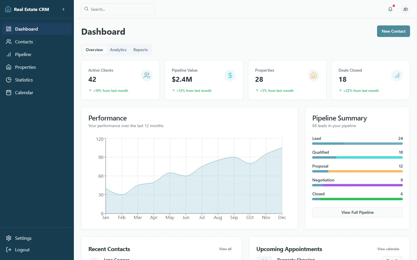
The Real Estate CRM is one of my self-initiated builds, not client work, so there are no client figures in this post. It is a record of the design decisions: what the dashboard puts in front of an agent first, and what it keeps out of the way until asked.
The pipeline comes first
An agent opening a CRM wants to know which deals moved and what to do next. When a dashboard hides the next action, people stop trusting it and go back to side notes, spreadsheets, or memory.
So the layout starts from the pipeline. Active leads, client state, appointment context, and revenue figures are visible on one filterable board, where they used to be spread across four separate list views.
Reports: a quick read first, detail on request
Reporting screens often fail because they give every question the same weight. Here, checking status and digging into analysis are separate: a quick read first, then detail when someone asks for it.
In practice that meant grouping related numbers, labelling them plainly, and keeping each summary card next to the table or chart it summarises.
Small fixes to repeated tasks
Most of the work was ordinary: filters that are easier to scan, actions that stay in the same place, lead cards with a clearer order of information, fewer metrics competing for attention, and proper empty states for accounts that have little data yet.
CRM users repeat the same tasks over and over, so a small delay in one of them adds up.
What I would measure with real users
If an agency ran on this, I would measure how long it takes to find an active lead, how many follow-ups get missed, how often reports are opened, and how many core pipeline actions get completed. Those numbers would show whether the design improved the daily work or only its appearance.
If your own dashboard has this kind of friction, a review of the interface is usually a cheaper first step than a rebuild. See dashboards and portals.
Where to go next
- Dashboards and portals
For a CRM, admin panel, or internal tool that spreads one task across three screens.
- Product UX and frontend cleanup
A pass over a live product: the type scale, spacing, and interaction states written down, and the tiring screens fixed in place.
- Tell me about your project
Describe the site or app you need. I reply within one business day.
Questions
- What should a CRM dashboard show first?
- The pipeline: active deals, overdue follow-ups, the next action on each, and enough revenue context to decide what comes first.
- Why do CRM dashboards need UX cleanup?
- Because the same tasks get repeated constantly, and filters, reports, lead cards, or actions that are hard to scan slow down every repetition.
Need a website that brings in customers?
I reply within one business day. Website builds typically start at £750. Or get a free teardown of your current site